Logo Design

A symbol and wordmark logo for local business

HigglePiggle came to me for a website design and branding completion, with the first element requiring attention being a half-finished logo. While some elements were in place, there was a lack of cohesion between them; in addition, the uniqueness of the brand was not yet coming through. HigglePiggle's logo now carries the weight of recognition in a charming aesthetic full of story.
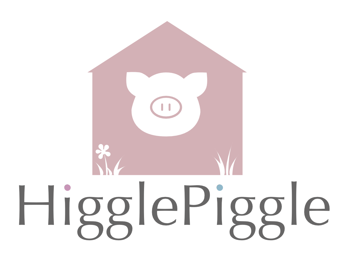
higglepiggle logo

Where we started

Pulling branding elements together

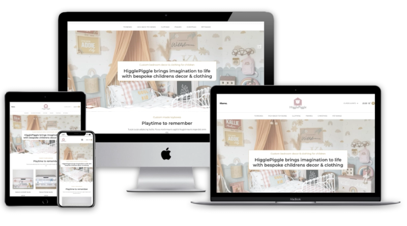
When I first met with Kirsty, her logo was more simply the piglet head -as depicted on her studio wall which you can see on their website page.

Additional imagery consistently featured other elements that Kirsty wished to portray, such as a shack of a wooden shed, a flower and blades of grass.

The outcome

Cohesion for branding elements in one logo

After experimenting with the various elements, I opted for bringing the shack and the pig's head together, before 'cutting out' the visual elements we had identified.

This allowed the logo to include various visual elements and paint an entire scene in one symbol, whilst still maintaining the most important design elements in a logo, such as simplicity and two-tone clarity.  This immediately elevated a simple 'pigs head' symbol (not unique) to a completely unique brand element that works as a symbol on its own.

Added to this, the wordmark was tidied and refined, with brand colours brought in for flourish.

  • Two-tone clarity
  • Simplicity
  • Story-telling

Have a project in mind?

Let's talk about what you want to build and where you want it to take you.